App Bar
Overview
The AppBar serves as an information hub for users, offering useful shortcuts and utilities. Its layout varies depending on the user's authentication status and the brand of the app.
To highlight a few features of the AppBar: Unauthenticated users can Search, Login, Join as new users, and view a Betslip counter. Authenticated users have access to the Search function, view the account Balance, Pending Bets, and the active Betslip. Additionally, the Locker presents the main promotions available to the user, while the Toolbox provides shortcuts to a list of useful tools. Finally, the UserTray which is accessible from the AppBar, offers quick access to user account options.
Branding
Aside from brand-specific logos, icons, and overall theming, the AppBar has a consistent layout across all brands, including Ladbrokes, Neds, TabNZ and Betcha.
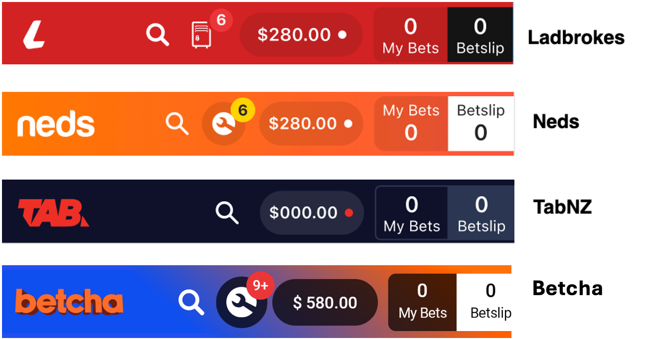
However, to provide a brief comparison without going too deep into specifics, two notable brand-specific functionalities accessible via the AppBar are the Locker and the Toolbox features.
The Locker is exclusive to Ladbrokes and offers to the users various betting promotions, while the Toolbox is available to Neds and Betcha, and it provides shortcuts to a list of tools. Currently, TabNZ does not incorporate either of these features.
Integrations
Considerations when adding a new brand
Android
In the Android platform, the primary components of the AppBar are located within the AppBar.kt file, in the src/main directory under presentation folder. This file includes the EntainAppBarContainer composable, which holds the AppBar's fundamental structure with three key components: AppBarLeftItems, AppBarCenterItems, and AppBarRightItems.
In the AppBarRightItems component we can find the most important functionalities from the AppBar such as the Search button, Login/Join buttons for unauthenticated users, and the Locker/Toolbox button. It also includes the My Bets/Our Bets and Betslip buttons. Modifications to this component could impact the app's behavior across different brands.
For adjustments or additions to app strings, modifications should be made in the res/strings.xml file located in the src/main directory.
AppBarUITheme
Having individual theme files will ensure that common UI components adapt to their own visual themes and behave according to the brand it's running on. For each new brand, we will need to add its own AppBarUITheme file, located in the theme directory. Any theme modification required for Ladbrokes, Neds or TabNZ will need to be done to their brand-specific theme/AppBarUITheme file.
AppBarViewModel.kt:
Locker/Toolbox Balance:
We can find the view model class at presentation/AppBarViewModel.kt in the src/main directory of the AppBar feature.
Upon init, it will call
with(onLockerOrToolboxHandlerDelegate) {
  observeLockerOrToolboxBalance(_state)
}
where onLockerOrToolboxHandlerDelegate is a brand specific handler implementation of the relevant functions
for the toolbox logic and observeLockerOrToolboxBalance(state: MutableStateFlow<AppBarState>)
is the brand specific function for observing the toolbox balance so it can be displayed as a badge
in the appbar.
This function can be found in the OnLockerOrToolboxHandlerImpl.kt file of each brand.
Ladbrokes:
fun ViewModel.observeLockerOrToolboxBalance(state: MutableStateFlow<AppBarState>) {
  loadLockerInfoUseCase.invoke().onEach { result ->
    state.value = state.value.copy(toolBalance = result.balance)
  }.launchIn(viewModelScope)
}
Neds:
fun ViewModel.observeLockerOrToolboxBalance(state: MutableStateFlow<AppBarState>) {
  loadToolboxInfoUseCase.invoke().onEach { result ->
    state.value = state.value.copy(toolBalance = result.balance)
  }.launchIn(viewModelScope)
}
TabNZ:
fun ViewModel.observeLockerOrToolboxBalance(state: MutableStateFlow<AppBarState>) = Unit
Betcha:
fun AppBarViewModel.observeLockerOrToolboxBalance() = Unit
In the AppBarViewModel.kt class, here we can find observeLockerBalance and observeToolboxBalance, which handles the balance for the Locker/Toolbox item for Ladbrokes and Neds.
fun observeLockerBalance() {
 loadLockerInfoUseCase.invoke().onEach { result ->
   _state.value = state.value.copy(toolBalance = result.balance)
 }.launchIn(viewModelScope)
}


fun observeToolboxBalance() {
 loadToolboxInfoUseCase.invoke().onEach { result ->
   _state.value = state.value.copy(toolBalance = result.balance)
 }.launchIn(viewModelScope)
}
If we need to introduce a new brand featuring notification badges similar to the Locker/Toolbox feature, we will have to implement a similar function to those previously mentioned. In the brand-specific presentation/AppBarViewModel.kt file, this new function will be invoked accordingly.
Toggle Locker/Toolbox:
When the Locker/Toolbox icon in the AppBar is clicked, the function toggleLockerOrToolbox is triggered. This extension function is part of the AppBarViewModel.kt file in the brand-specific presentation directory and is called from the EntainAppBarContainer component located in the AppBar.kt file. The click interaction happens in the AppBarRightItems section of the AppBar.kt, where the Locker/Toolbox icon is located.
Ladbrokes:
fun AppBarViewModel.toggleLockerOrToolbox(navigationHandler: () -> Unit) {
 this.toggleLadbrokesLocker()
}
Neds:
fun AppBarViewModel.toggleLockerOrToolbox(navigationHandler: () -> Unit) {
 this.toggleToolbox(navigationHandler)
}
TabNZ:
fun AppBarViewModel.toggleLockerOrToolbox(navigationHandler: () -> Unit) = Unit
Both toggleLadbrokesLocker and toggleToolbox functions will be available in the AppBarViewModel.kt in the src/main/ directory. The toggleLadbrokesLocker function will toggle the visibility of the Locker for Ladbrokes while toggleToolbox function will navigate to the Toolbox modal for Neds.
fun toggleLadbrokesLocker() {
    viewModelScope.launch {
        // If the locker is opening over the usertray. dismiss the usertray before opening the locker
        if (!state.value.lockerVisible && state.value.userTrayVisible) {
            sharedStateSetVisibilityUseCase.invoke(SharedDataState.UserTrayVisibility, false)
            delay(300)
            sharedStateSetVisibilityUseCase.invoke(SharedDataState.LockerVisibility, true)
        } else {
            sharedStateSetVisibilityUseCase.invoke(
                SharedDataState.LockerVisibility,
                !state.value.lockerVisible,
            )
        }
    }
}

fun toggleToolbox(navigateToToolbox: () -> Unit) {
    viewModelScope.launch {
        navigateToToolbox.invoke()
    }
}
If the new brand that we are adding requires to show a module similar to the Locker/Toolbox feature, then we will have to add a new function similar to these previously mentioned.
As per the new brand-specific presentation/AppBarViewModel.kt file, toggleLockerOrToolbox will have to call this new function.
iOS
In the iOS platform, the primary components of the AppBar are located under AppBarUI in the PresentationLayer and AppBar in the DomainLayer.
The entry point to the AppBarUI is via the AppBarCoordinator. This will create the app bar as a custom view for the rightBarButtonItem if its hosting viewController set it via a call to update state .
The app bar follows the VENOM paradigm and has a presenter, view, viewModel, transformer and interactor.
Note the app bar was built early on and before it was decided that presenters should collate interactors over the component having its own interactor.
Each tab is a NavigationController and will have its own copy of an app bar. Any view that is subsequently pushed or presented onto the stack that needs the app bar, will also contain its own copy. So many app bar can exist in memory at any given time.
AppBar
The app bar uses semantic values to style itself according to the app target that’s running it. The BundleProvider is injected into on app bar type that requires it. Most app target differences are decided in the AppBarTransformer, however, some views will display based on the target.
AppBarViewModel:
The authentication state will tell the view to switch its state based on this value.
AppBarViewModel.BalanceViewModel
The AppBarViewModel.BalanceViewModel refers directly to the balance pill that houses the user's balance. As the app bar is a SwiftUI view but housed inside a UIKit navigation bar, there is some strange resizing behaviour that can occur. To counter this, whenever the BalanceView changes its size, it calls a delegate to notify that its width has changed and that UIKit must update its constraints. If this is not performed, then the app bar will likely jiggle around.
This is why the BalanceViewModel is its own ObservableObject. Any updates to this file are separate from other changes to the AppBarViewModel.
AppBarViewModel.BuildFlavorViewModel
An antequated view model and could be up for refactor. Some elements of the app bar change based on the app target. The potIcon is such an example where on Ladbrokes and Neds, this icon is different. TabNZ doesn’t have a potIcon.
AnimatedCounterTextViewModel
This is essentially the betslip counter view model. It’s also a separate view model so that its updates can be made and redrawn separately from other ui components. This view uses a LazyVStack and utilises the proxy.scrollTo of a List to animate the counter.
AppBarInteractor
The interactor is the central point of communication with data. The interactor will respond to authentication state updates, balance changes and toolbox notification changes.
Any change will create a new AppBarData and this model will be sent via its passthrough subject most likely to the AppBarPresenter. The AppBarDataTransformer is responsible for transforming any data from an interactor into AppBarData for propagation.
AppBarPresenter
The presenter handles the flow of data from the DomainLayer to the PresentationLayer. It acts as the bridge between the interactor and the transformer.
The presenter will also have a delegate, AppBarPresenterDelegate that will forward on AppBarView button selections and user interactions. The delegate will likely forward these messages to the AppBarCoordinator. All the actions for the button selections are in the type that conforms to the delegate and implements its methods. That’s the AppBarCoordinator.
Feature Flags
This section provides an overview of the integrations related to the AppBar. These integrations close in to internal configurations, external services, third-party SDK and data management systems.
betslip-native- Will determine if we should navigate to the Native or RN Betslip Modal.
- For Android: If the flag is set, then it will retrieve the Betslip Count through DAO , otherwise it will use the BetslipModule to get the value through the SharedState.
pending-resulted-native- Will determine if we should navigate to the PendingResultedBets screen or the AccountTransactions with params to navigate to Pending Bets tab.
login-native- Determines whether the Native or RN Login Modal is used.
Inputs
GQL: ClientDetailsStartupQuery
- Used to load the users Social Profile.
Android:
DB: BetslipDAO
- Used to load the Betslip count.
Outputs
Third-Party Dependencies
Android:
Firebase Analytics
Used to log the events of the AppBar.
Troubleshooting
Android
Adapting and Testing UI Across Android Versions and Screen Sizes
To develop adaptable UIs with Jetpack Compose, we must make sure we maintian compatibility across a wide range of Android devices, featuring various Android versions and screen sizes.
Preview Annotations:
Using preview annotations such as @EntainPreview, @SmallPreview and @Preview allows us visualize UI components on different screen devices. It is best to customize the parameters on these annotations to address any potential layout discrepancies.
Beyond IDE previews, testing the UI on emulators and physical devices also helps identifying any possible issue related to visualization or version compatibility.
Version Compatiblity: Always consider the impact of different Android versions on the app's UI and functionality. Test across different devices to ensure behavior is consistent.
Preventing Overlap Between Items
To prevent items in the center (AppBarCenterItems) from overlapping with those in the AppBarRightItems, a minimum number of items should be displayed on the right side of the bar.
iOS
App Bar Jiggles Around
This is due to the interaction between UIKit and SwiftUI. It appears as though once a custom view is set on the rightBarButtonItem of the navigationItem, the constraints do not update if the content size of the view changes.
If the SwiftUI views have fixed dimensions, then this isn’t an issue. However, the BalanceView has dynamic text and its width can resize based on this text. To ensure that the text takes up the most space, the view modifier, .fixedSize() is applied to the two Text()s in the BalanceView. If we allow this view to resize and be flexible, its width becomes in consistent and the view jiggles around or compresses to the point its not visible.
If we do not update the constraints when we have a fixed sized text, then the app bar will also jiggle around.
The SwiftUI view needs a way to tell the UIKit _UIHostingView that it needs to update its constraints. This is achieved in the following way:
- Use a
GeometryReaderon theBalanceViewon a background view modifier and respond to when the width changes. - When the width of the proxy changes, then call the delegate method that the view has changed its width.
- The
AppBarCoordinatorresponds to this delegate method and callsupdateConstraints()on the_UIHostingViewwhen the item is reset in theupdateState()method of the coordinator.
If this becomes too problematic, then it might make sense to refactor the app bar to fully utilise UIKit instead of teh SwiftUI view.
Animated Counter Scrolls When Screens Change
The AnimatedCounterTextView uses the performance efficiency of a LazyVStack and List. Experiments were run to see how this would perform with 1 million items in the list and performance was the same as ten items.
In .onAppear{}, the proxy is asked to scroll to the current location. In the .onChange{} view modifier, wraps the scroll to call in an animation. This works great. However, when navigating back to a screen from a child, both .onAppear{} and .onChange{} get called with the latter seemingly taking precedence. This leads to a short scroll animation to get to the same number as the child screen.
To counter this, a bool called canAnimate is set to false when the view disappears. In the .onChange{}, the view will only animate if this bool is true. When the view reappears, this value will be false, so we’ll scroll to and then set the variable to true. So that when the next value changes, it will animate.
Initialising the AppBarPresenter
Because each screen will have its own app bar, we need a way to instantly populate the data so we don’t see a flickering of values when navigating between screens. To do this, the AppBarInteractor has a getter on the appBarData that the presenter will use to populate its state and update the ui.
We may want to introduce a call to refresh the interactor in the init of the presenter, but this practice isn’t encouraged.
Resources
| Role | Contact |
|---|---|
| PM | TBC |
| Android Lead | Anthony Librio |
| iOS Lead | Nicholas Vella |