User Tray
Overview
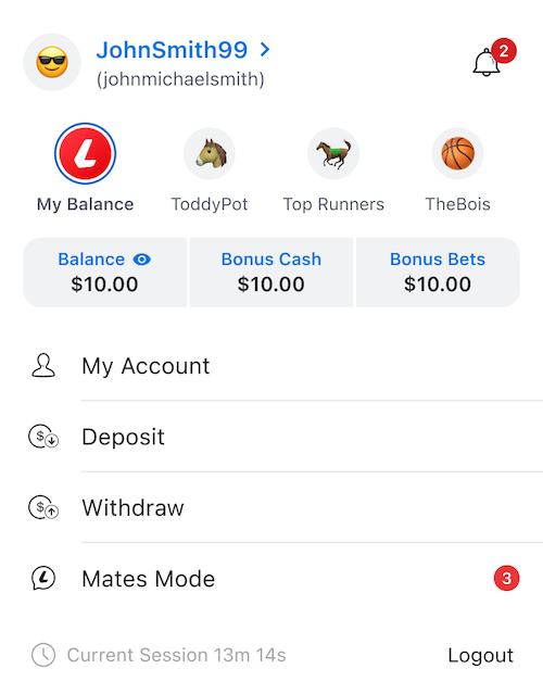
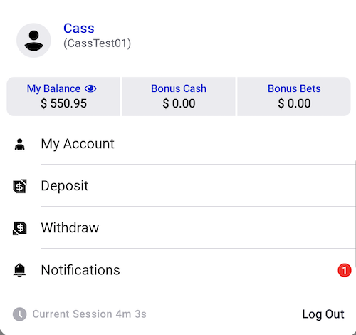
The User Tray is a modular view that slides in from the top of the screen and can be overlaid over any screen displayed by the app. It is divided into five main sections: a block showing the user's account details such as username and notifications, an optional list of groups/pots the user is connected to, the balance details of the selected pot (or the user's personal balance), a list of actionable items, and a footer showing the length of the current session and a Logout button.
Menu Items
The items displayed on the user tray menu vary depending on the current profile state and selected pot. Options to view the user's account, and deposit or withdraw into their personal balance are always shown. If the user has no social profile, these are the only options shown. If they do have a social profile, and no pot selected, then a Mates/Group Mode (depending on brand) is also shown. Finally, if the user has a pot selected (regardless of social profile), then links for Our Bets and Go to Group are also shown.
Other Interactivity
- On brands with social profiles enabled and where the user has one, they can tap the account details to be navigated to a page to view/change their social profile details.
- Tapping the notifications bell takes the user to their notifications view.
- If the pots are displayed, the user can tap a pot to select it, updating the displayed balance view both on the user tray and the app bar.
- The user can tap the balance to toggle whether it is shown or hidden in the app bar.
- The user can logout by tapping the logout button. There is no confirmation screen or dialog.
Branding
In addition to standard theming (including icons on the list), the main distinction between brands is whether or not they support social profiles, and by extension group pots. By default, this should be innately supported by the code - a user object that does not support a social profile or pots will not return any, and the elements that refer to those features is omitted.
In addition, the items on the actions list can vary subtly between brands. As such, it is important to double-check that the items in all possible states are correct, and to implement a unique brand variant if not.
The TabNZ variant of the app currently does not support social profiles or groups, so it will always omit the pot list when displayed. It also includes a Notifications item in the action list instead of a notifications icon next to the username like the other brands.
Android: UserTrayTheme.kt
This file reflects some semantic and feature changes between the different brands that are not
adequately covered by tokenisation. Of particular note is EnableSocialProfile, which hides
and alters certain elements of the account details on brands that do not have social profile
features enabled; EnablePots, which prevents the pots/group block being shown if set to false,
and EyeIcon/EyeIconSlash, which specify assets to use for the show/hide balance visibility icon.
This last one is required because TabNZ uses a different semantic asset for the eye slash icon.
iOS User Tray
Architecture
In the iOS platform, the primary components of the User Tray are located under UserTrayUI in the PresentationLayer and UserTray in the DomainLayer.
The entry point to the UserTrayUI is via the UserTrayCoordinator. This coordinator maps to a native-only route. Meaning that there is no equivalent RN route. The coordinator uses the custom FullScreenUIHostingController as a modal presentation so that its view fills up the whole screen.
The User Tray follows the VENOM paradigm and has a presenter, view, viewModel, transformer, and interactor.
Navigation
The UserTrayPresenter was built early in the project and doesn’t have a delegate to handle navigation routing. Any navigation is handled by the onTapAction(_ actionType: UserTrayViewModel.UserAction) method. Should the need arise to modify these paths, this is the place to do it.
The opening and closing of the User Tray is handled by the App Bar. The navigation rule, NavigateDrawerRule is responsible for navigating to and away the User Tray and the Locker.
Changing the Display
You can adjust the display of the view in a couple of ways:
Setting the UserTrayViewModel.UserTrayMode.
Adjusting the menu items in the UserTrayTransformer.
Each of these adjustments will be made in the UserTrayTransformer as it produces a UserTrayViewModel that the UserTrayView will read and display from.
Troubleshooting
During development, the FullscreenUIHostingController was built for the UserTrayView and the LockerView. This is due to the view not resizing correctly after its intrinsic content size changes. This is most likely due to the constraints not being updated when the size changes.
This controller ensures that the view's bounds match the superview’s bounds.
Custom Modal Animation
The Locker and the User Tray have unique modal animations. As these views are hosted by UIKit, it made sense to create UIKit present and dismiss animations. The SlideInPresentationManager is the delegate that contains the animation and the controller for these animations.
The SlideInPresentationController contains the dimensions and the background dimming view. The SlideInPresentationAnimator contains the animations for the sliding down.
This SlideInPresentationManager has a property called direction that dictates the slide in direction. It defaults to the top to align with the functionality of the User Tray and the Locker.
Note: The Neds Toolbox does not use this delegate as its modal presentation uses the system’s default.
Integrations
Feature Flags
Observes the PENDING_RESULTED_NATIVE feature flag. The Betslip menu item navigates to different
destinations depending on the value of this flag.
Inputs
RN: GraphQLModule
The user tray displays the user's client details, social profile details (if applicable), and the balance of their pots/groups from the GraphQL ClientDetailsStartupQuery.
RN: UserInfoModule
The user's selected pot, or having their personal balance selected, and the values of each of these balances can be set if RN sends an update.
As of 10 Apr 2024, RN also provides updates to the count of account notifications, which is displayed alongside a bell icon within the account details block.
RN: GroupModeModule
As of 10 Apr 2024, RN provides updates to the count of unread group mode notifications, which is displayed on the list.
REST: GET client/PendingBetCount
Fetches the pending bet counts for the user's pots, and updates the locally stored values with it
Outputs
Authentication
The user can logout from within the user tray by tapping the Logout button. This action also automatically dismisses the user tray (as you must be logged in to view it).
Balance Visibility
The user can specify that their balance should be shown or hidden on the top app bar. If hidden, the user's first name will be shown on the top app bar instead. Note that the balance is still shown in the user tray, even when in hidden mode.
Selected Pot
The user can select a group/pot to highlight. If set, the app bar will show the pot name and balance. The user can also deselect a pot (selecting My Balance), or may have no pots available, in which case the app bar will show the user's personal balance (or name; see Balance Visibility).
RN: UserInfoModule
When the user (de)selects a pot, this updated selection is sent over the bridge to RN, as some RN screens still use it.
Resources
| Role | Contact |
|---|---|
| PM | TBC |
| Android Dev | Jonathan Head |
| iOS Dev | Brent Crowley |