Neds Toolbox
Overview
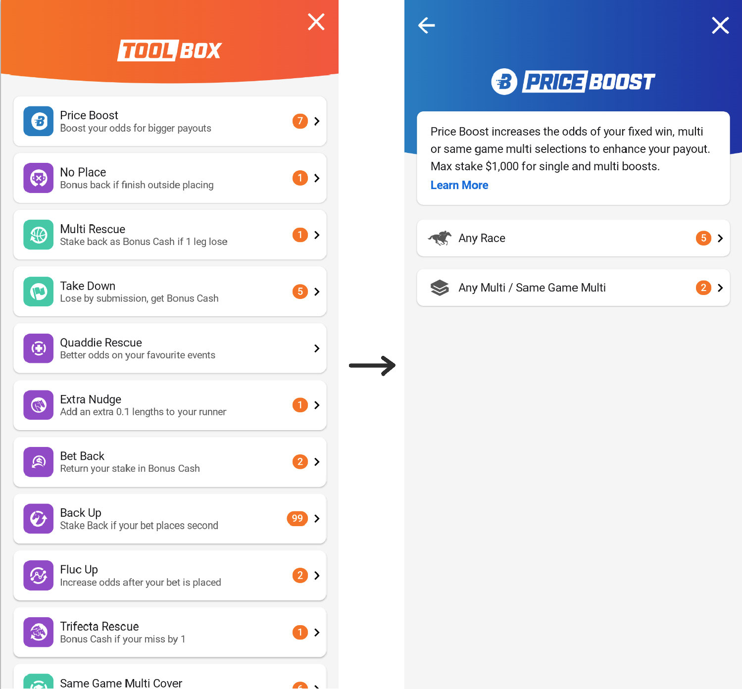
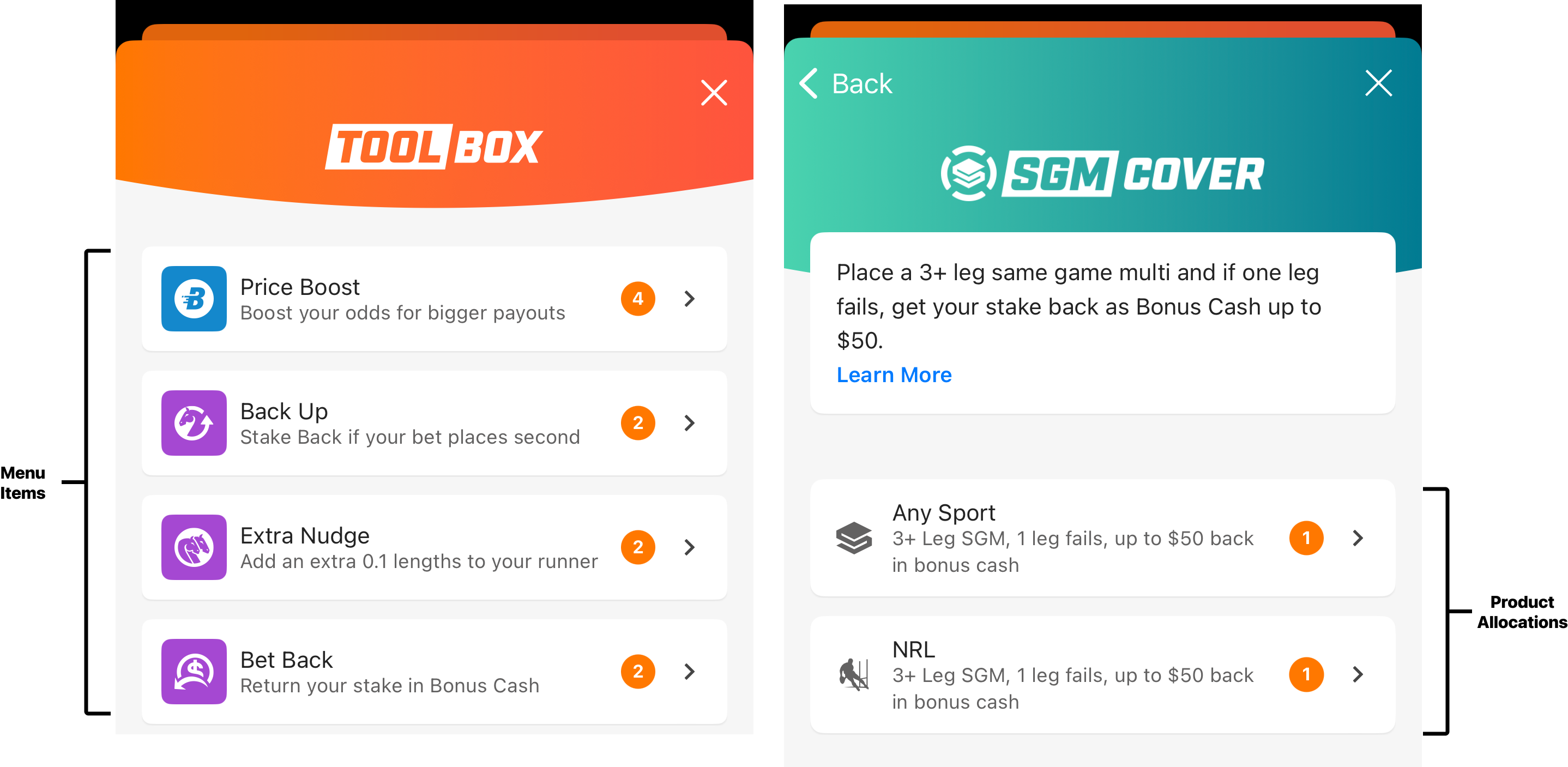
The Toolbox is a feature specific to Neds, accessible to users by clicking on the Toolbox item in the AppBar. This feature provides users with a wide variety of tools designed to enhance their betting experience. Each tool is presented as an item in the Toolbox, featuring an icon, title, brief description, and the current number of allocations available for that tool type. The Toolbox items can be categorized into Product Items and Support items.
These are the Product items available on the Toolbox:
- Price Boots
- No Place
- Multi Rescue
- Take Down
- Quaddie Rescue
- Extra Nudge
- Bet Back
- Back Up
- Fluc Up
- Trifecta Rescue
- Same Game Multi Cover
Aditionally, these are the Support Items available on the Toolbox:
- Punter Assist
- Toolbox Tips
When users click on a Product item, they will be navigated to a detail page that provides a description of the selected tool. This page also includes a "Read More" button, which will display additional information in a web view. For the Support Items, selecting the Punter Assist option navigates users to the `"AccountPunterAssist" screen. As for the Toolbox Tips option, it will open an external browser directing users to the toolbox tips website for further guidance and information.
Android Toolbox
The Toolbox was implemented using the Model-View-ViewModel (MVVM) architecture in conjunction with the Clean Architecture framework.
The entry point to the Toolbox feature is the ToolboxEntryScreen component (located in presentation/ToolboxEntryScreen.kt in the Neds flavour).
This component calls the ToolboxList component (located in the presentation/list/ToolboxList.kt file in main) and passes through a list of products ToolboxProductItem, a list of support items ToolboxSupportItem, and the events required for the Toolbox.
In the components folder, we find the ToolboxItemCard.kt used to display each item in the Toolbox.
The models folder serves to define the data structures directly used in the presentation layer, these models hold the data for which the UI will display.
To highlight a few, ToolboxModels.kt includes various item definitions such as ToolboxProductItem and ToolboxSupportItem, used by the UI components to render each item.
Another essential data class to mention is the ToolboxState, which encapsulates the overall state of the Toolbox, managing the collection of product items and other important states.
presentation/list/utils/ToolboxListTypeExtensions.kt
This file contains several extension functions for the ToolboxProductType enum, providing additional behaviors and properties relevant to the functionality of the Toolbox.
Some noteworthy functions to mention include:
getProductGradientColour(), which returns a specific gradient brush for different types of products.getProductHeading()andgetProductSubheading(), which provide the display labels and descriptions for the UI components.getProductLeadingImageId()andgetLeadingIconBackgroundColor(), provide the drawable resource IDs and background colors for the icons associated with each product type.
presentation/list/models/ToolboxSupportType.kt
This class defines an enum type ToolboxSupportType to categorize PUNTER_ASSIST and TOOLBOX_TIPS, used to define the itemType in ToolboxSupportItem. It also contains several extension functions relevant to the Toolbox support items.
Some noteworthy functions to mention include:
getSupportItemHeading()andgetSupportItemSubheading(), which return resource IDs for headings and subheading texts.getLeadingIconId()andgetLeadingIconBackgroundColor(), which provide IDs for the images and background colors for the icons associated with each support item.
ProductDetailViewModel.kt
The ProductDetailEntryScreen is responsible for displaying the details of the product selected from the ToolBox screen. It takes the ProductDetailViewModel as a parameter and manages the state related to the product details.
ToolboxListViewModel.kt
The ToolboxList.kt component is responsible for rendering the main components in the ToolBox, including all the ToolBoxProducts and the ToolBoxSupportItems. The ToolboxListViewModel manages the state and business logic related to Toolbox features.
It has two dependencies: LoadToolboxInfoUseCase and GetToolboxTipsUrlUseCase. Upon initialization, the functions observeToolboxBalance() and getToolboxTipsUrl() are called, which invoke the LoadToolboxInfoUseCase() and GetToolboxTipsUrlUseCase() functions, respectively.
The LoadToolboxInfoUseCase updates the ToolBoxInfo to the state of the ViewModel, which is then used to map the balance of each product and display a badge count for each product in the Toolbox.
The GetToolboxTipsUrlUseCase retrieves the URL of the Toolbox Tips. This URL is obtained using the AppConfigProvider.
Finally, the navigateToProductDetail function will be responsible for navigating to the product detail screen for a specified ToolboxProductType:
fun navigateToProductDetail(productType: ToolboxProductType) {
  val productTypeArgument = productType.name
  navController.navigate(
    route = ModalRoute.ToolboxProductDetail.routeWithParams(
      productType = productTypeArgument,
    ),
    navigationType = EntainNavController.NavigationType.PushIfNotOnTop(),
  )
}
Navigation will be done by using navController.navigate function, and the route specified is ModalRoute.ToolboxProductDetail.routeWithParams with productType as parameter which will contain the selected ToolBox product.
ToolboxList.kt & ToolboxProductDetailEntryScreen.kt
These entry screens serve as the primary user interfaces for interacting with the Toolbox feature.
The ToolboxList is used as the main Toolbox screen and will display various toolbox products and support items available to the user.
This file contains the main composables used to draw the ToolBox feature.
Specifically, the Toolbox component will be in charge of managing the Toolbox Top Bar with the gradient background and scroll behavior, the Header Image to resize dynamically, the Toolbox Product and Support items, and also the Close button.
As for the ToolboxProductDetailEntryScreen, it will be used as the entry screen to display detailed information about the selected toolbox product.
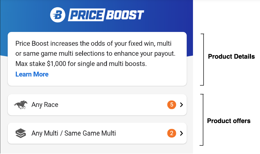
The ToolboxProductDetail contains the main composables used to draw the details of the product selected from the ToolBox main screen.
It will be in charge of managing the Top Bar to use a gradient background and back navigation, the Header section which will display the product image and description within the curved container, product description along with a "Learn More" button.
domain/list/model/ToolboxInfo.kt
This class defines a data class, ToolboxInfo, representing various toolbox products and their associated balances. Each product, such as "priceBoost" and "betBack", is represented by a ToolboxProduct data class, containing its balances.
This class encapsulates the data structure for ToolboxInfo, which encompasses a collection of toolbox products along with their corresponding balances. Each product, such as "priceBoost" and "betBack", is represented as a ToolboxProduct data class, which includes information about its balances.
The ToolboxInfo class also includes a balance property, which calculates the total balance across all toolbox products.
data class ToolboxInfo(
    val priceBoost: ToolboxProduct = ToolboxProduct(),
    val betBack: ToolboxProduct = ToolboxProduct(),
    val multiRescue: ToolboxProduct = ToolboxProduct(),
    val sameGameMulti: ToolboxProduct = ToolboxProduct(),
    val takeDown: ToolboxProduct = ToolboxProduct(),
    val noPlace: ToolboxProduct = ToolboxProduct(),
    val backUp: ToolboxProduct = ToolboxProduct(),
    val extraNudge: ToolboxProduct = ToolboxProduct(),
    val trifectaRescue: ToolboxProduct = ToolboxProduct(),
    val flucUp: ToolboxProduct = ToolboxProduct(),
    val quaddieCover: ToolboxProduct = ToolboxProduct(),
) {
    val balance: Int
        get() = priceBoost.balance + betBack.balance + multiRescue.balance + sameGameMulti.balance +
        takeDown.balance + noPlace.balance + backUp.balance + extraNudge.balance +
        trifectaRescue.balance + flucUp.balance + quaddieCover.balance
}
data class ToolboxProduct(
    val balance: Int = 0,
    val productOffers: List<ProductOffer> = emptyList(),
)
The ToolboxProduct's can contain a list ProductOffer's which are displayed in the ToolBoxProductDetail component. A list of ToolboxItemCard's will be displayed below the ProductDescription.
ToolboxDataMapper.kt
This mapper is used by the LoadToolboxInfoUseCase.
The map function takes an instance of ToolboxBridgeData (fetched from the SharedStateGetUseCase<ToolboxBridgeData>) and maps it to a corresponding ToolboxInfo object. Within this function, the attributes of the ToolboxInfo object are populated based on the data from ToolboxBridgeData. Each ToolboxProduct within the ToolboxInfo is assigned the corresponding balances and product offers based on the data from ToolboxBridgeData.
Considerations when adding a new brand - Toolbox
While the Toolbox List is exclusively used in Neds, the code lives in the main folder of the code which allows for easy reusability.
The ToolboxEntryScreen lives in each brand flavour folder which allows the application of the brand theme.
For a new brand to use the Toolbox List, the new brand must add its own ToolboxEntryScreen calling the ToolboxList component, applying its own brand theme, and passing on the state and necessary event handlers.
The existing ToolboxListViewModel can be injected or a new View Model can be created with specific functionality.
iOS Toolbox
Architecture
On iOS, the Neds Toolbox is implemented using the Combine architecture and follows the VENOM pattern, consisting of a view, viewModel, presenter, transformer, and interactor.
The main UI components and view logic for Toolbox, can be found under the GenerosityUI in the PresentationLayer, and the Toolbox module in the DomainLayer.
The path into the GenerosityUI is via the GenerosityCoordinator. Used by both Neds Toolbox and Ladbrokes Locker.
The method getViewController() checks which app target is running and will contruct the Toolbox view using makeToolboxViewController() if the target is Neds.
Similarly the ToolboxProductCoordintaor is the entry point for the Toolbox Product details page, this is pushed onto the stack when a Toolbox Product is selected from the menu.
Navigation
The GenerosityCoordinator conforms to ToolboxPresenterDelegate which handles navigation into the native Toolbox Product details view. There is also two additional navigation points, Punter Assist which deeplinks to the help section in the More Menu and Toolbox Tips which opens a webpage outside of the app.
The ToolboxProductCoordintaor conforms to the ToolboxProductPresenterDelegate. There are two main navigation points for the Toolbox Product details screen, Firsty there is Learn More, found in the Toolbox Product description at the top of the page. When this is selected, a Webview will be displayed modally, containing details about that Toolbox Product. At the bottom of the page you will find the Toolbox Product Allocations list, the routes for these items are determined by the type of allocation associated with that Toolbox Product. When selected, they will navigate to the relavent section of the Neds app.
Toolbox Views
Two main screens make up the Neds Toolbox, ToolboxView is the first screen presented, it contains a list of all the Toolbox Product types available to the user. Once a Toolbox Product has been selected, the user will be pushed to the ToolboxProductView, containing information about the product and the allocations available.
Both of these screens use the ToolboxScrollView, this custom scrollview sends updates on its scroll position using the callback method onScrollPositionUpdated. The updated values are received by the ToolboxHeaderView animating the provided logo, updating the header size and shape.
ToolboxPresenter
The ToolboxPresenter, receives balance data related to all the Toolbox Products, from the ToolboxBalanceInteractor, in addition it also receives the url used for the Toolbox Tips route, from the AppConfigInteractor.
    func startObservers() {
        // Toolbox Balance
        toolboxBalanceInteractor
            .toolboxBalancePublisher()
            .receive(on: DispatchQueue.main)
            .sink { [unowned self] balance in
                self.updateState(balance: balance)
                Task { await self.updateAllBalancesUI() }
            }
            .store(in: &cancellables)

        // Toolbox tips url
        appConfigInteractor
            .toolboxTipsModelPublisher()
            .receive(on: DispatchQueue.main)
            .sink { [unowned self] data in
                self.updateToolboxTipsURLWithData(data)
                Task { await self.updateUI() }
            }
            .store(in: &cancellables)
    }
ToolboxTransformer / ToolboxItemBuilder
When updated data is received from the ToolboxBalanceInteractor, its then passed to the ToolboxTransformer whose child dependancy ToolboxItemBuilder, converts the data into a ToolboxItemViewModel.
   func makeMenuItemViewModels(with state: ToolboxPresenter.State) -> [ToolboxItemViewModel] {
        ToolboxProduct.allCases.map {
            toolboxItemViewBuilder.makeMenuItem(
                product: $0,
                toolboxBalance: state.toolboxBalance,
                viewType: .menu
            )
        }
    }

    func makeProductAllocationItemViewModels(
        with state: ToolboxPresenter.State,
        product: ToolboxProduct
    ) -> [ToolboxItemViewModel] {
        toolboxItemViewBuilder.makeProductAllocationItems(
            product: product,
            toolboxBalance: state.toolboxBalance,
            viewType: .productDetails
        )
    }
This ToolboxItemViewModel serves as a display for both the Menu Items and the Product Allocation Items on the details screen. An individual menu item, displays a combined balance of all allocations for the given product. Selecting that product, will move the user to the details screen, displaying the individual product allocation items and their balance.
ToolboxProduct
ToolboxProduct is a enumerator which contains each product type as listed in the Toolbox menu.
   public enum ToolboxProduct: String, CaseIterable {
    case priceBoost
    case backUp
    case extraNudge
    case betBack
    case flucUp
    case multiRescue
    case noPlace
    case quaddieRescue
    case takeDown
    case trifectaRescue
    case sgmCover
    case punterAssist
    case toolboxTips
}
This class also contains computed properties representing the Toolbox Product items gradient header colour, menu icon, icon colour, logo and description.
public extension ToolboxProduct {
    var logo: EntainIcon {
        switch self {
        case .priceBoost: return EntainIcon.priceBoostLogo
        case .extraNudge: return EntainIcon.extraNudgeLogo
        case .multiRescue: return EntainIcon.multiRescueLogo
        case .noPlace: return EntainIcon.noPlaceLogo
        case .backUp: return EntainIcon.backUpLogo
        case .betBack: return EntainIcon.betBackLogo
        case .quaddieRescue: return EntainIcon.quaddieRescueLogo
        case .trifectaRescue: return EntainIcon.trifectaRescueLogo
        case .flucUp: return EntainIcon.flucUpLogo
        case .takeDown: return EntainIcon.takeDownLogo
        case .sgmCover: return EntainIcon.sgmCoverLogo
        case .punterAssist, .toolboxTips: return EntainIcon.toolboxLogo
        }
    }
}

// Gradient Colours
public extension ToolboxProduct {
    var startColor: Color {
        switch self {
        case .priceBoost:
            return ToolboxTheme.blue.startColor

        case .noPlace, .backUp, .betBack, .quaddieRescue, .extraNudge, .trifectaRescue, .flucUp:
            return ToolboxTheme.purple.startColor

        case .sgmCover, .multiRescue, .takeDown:
            return ToolboxTheme.teal.startColor

        case .punterAssist, .toolboxTips:
            return ToolboxTheme.orange.startColor
        }
    }
}
ToolboxTheme
ToolboxTheme is a enumerator which contains colour variations for the various Toolbox Product types, these colours are displayed in the ToolboxHeaderView as a gradient and as an icon colour for the menu items.
 public enum ToolboxTheme: Equatable {
    case orange
    case blue
    case purple
    case teal

    var startColor: Color {
        switch self {
        case .orange: return EntainColor.brandGradientEnd.color
        case .blue: return Self.blueLight
        case .purple: return Self.purpleLight
        case .teal: return Self.tealLight
        }
    }

    var endColor: Color {
        switch self {
        case .orange: return EntainColor.brandGradientBegin.color
        case .blue: return Self.blueDark
        case .purple: return Self.purpleDark
        case .teal: return Self.tealDark
        }
    }
}
Android Troubleshooting
Static Resources from the "static-ui" Project
When managing static resources across different brands, the preferred approach is to use resources from the "static-ui" project. This repository has a comprehensive collection of static images, files, and assets used in all of the brands under Entain.
To access these resources, clone the repository and follow the setup instructions provided. For more details, visit the following link: https://git.neds.sh/technology/code/ui/static
iOS Troubleshooting
During development, the FullscreenUIHostingController was built for the UserTrayView and the LockerView. This is due to the view not resizing correctly after its intrinsic content size changes. This is most likely due to the constraints not being updated when the size changes.
This controller ensures that the view's bounds match the superview’s bounds.
Custom Modal Animation
The Locker and the User Tray have unique modal animations. As these views are hosted by UIKit, it made sense to create UIKit present and dismiss animations. The SlideInPresentationManager is the delegate that contains the animation and the controller for these animations.
The SlideInPresentationController contains the dimensions and the background dimming view. The SlideInPresentationAnimator contains the animations for the sliding down.
This SlideInPresentationManager has a property called direction that dictates the slide in direction. It defaults to the top to align with the functionality of the User Tray and the Locker.
Note: The Neds Toolbox does not use this delegate as its modal presentation uses the system’s default.
Configuration
toolbox.toolbox-blog-tips-url- Blog and Tips URL - from App Config.
Resources
| Role | Contact |
|---|---|
| PM | TBC |
| Android Lead | Anthony Librio |
| iOS Lead | Nicholas Vella |