Join Form (AU Brands)
Overview
The form for collecting new user details is split into 2 screens. Page 1 starts off with some basic information, including the user's preferred login details and their name, while Page 2 requires more involved details, such as the user's dob, mobile number, address and deposit limit preference.
Both pages share a progress bar at the top of the screen which helps the user track their progress and to prevent them from being discouraged by the length of the form.
Page 1
If the user proceeds to the form from the welcome screen, then the email field will be prefilled and validated, and the initial focus will be on the username field. If the welcome screen is feature flagged off, then the email field will be focused and ready to be entered.
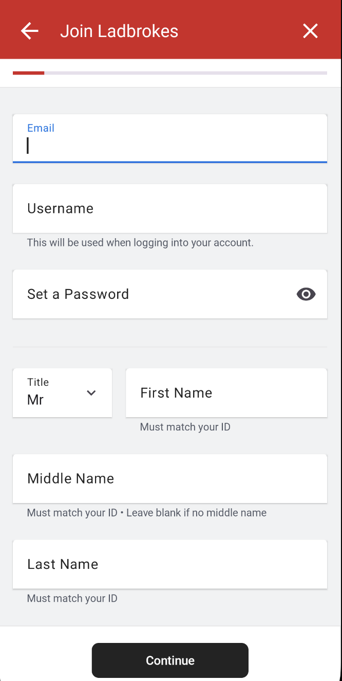
All of the following fields are mandatory unless they are flagged as optional. Mandatory fields get validated that they are not empty.
Email Address
The validation on this field matches that on the welcome screen.
- The field must match the regex of a valid email.
- The field must be unique according to the check email API.
- If this API call fails for any reason, then the system alert dialog will be shown when the user attempts to proceed to page 2.
Username
- The field must only contain alphanumeric characters.
- The field must contain at least one letter.
- The field gets validated for uniqueness via an API call.
- As with email, the user will be made aware of a failed call when "Continue" is pressed.
Password
The password is a unique input field in that validation occurs on every keystroke as well as when the field is de-focused. This is so that the user can see their password progressively satisfy each condition as the password they enter gets 'stronger'.
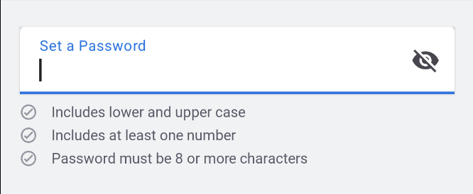
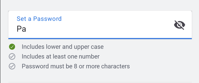
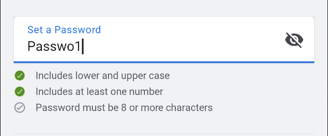
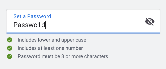
All the validation requirements are outlined in the page's UI upon field focus.
Title
This field is displayed as a dropdown menu of frontend hardcoded titles. The first title in the menu ("Mr"), is already selected on form initialisation, so no validation is required as it can never be in an invalid state.
The fact that this field is mandatory and always valid, means the progress bar will never be less than 10%.
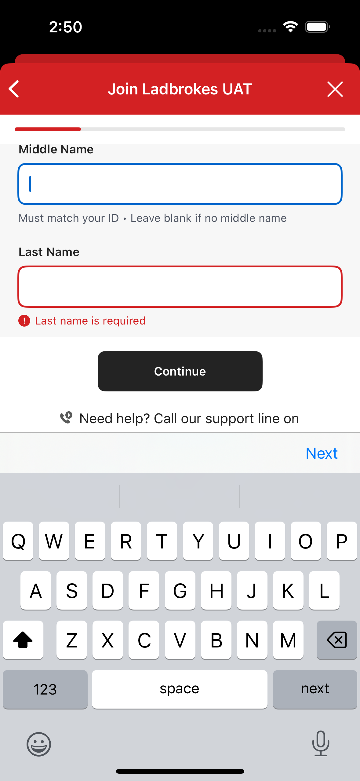
First Name
- This field must only contain alpha characters, spaces, apostrophes and hyphens.
Middle Name
An optional field that only accepts alpha characters, spaces, apostrophes and hyphens.
- This field is allowed to be empty, but if it isn't then the input still gets validated.
- Given this is an optional field, it's validation does not contribute to the progress bar.
Last Name
- This field must only contain alpha characters, spaces, apostrophes and hyphens.
Page 2
After clicking "Continue" button at the bottom of the form for Page 1, Page 2 will be displayed and focused on the Date of Birth field.
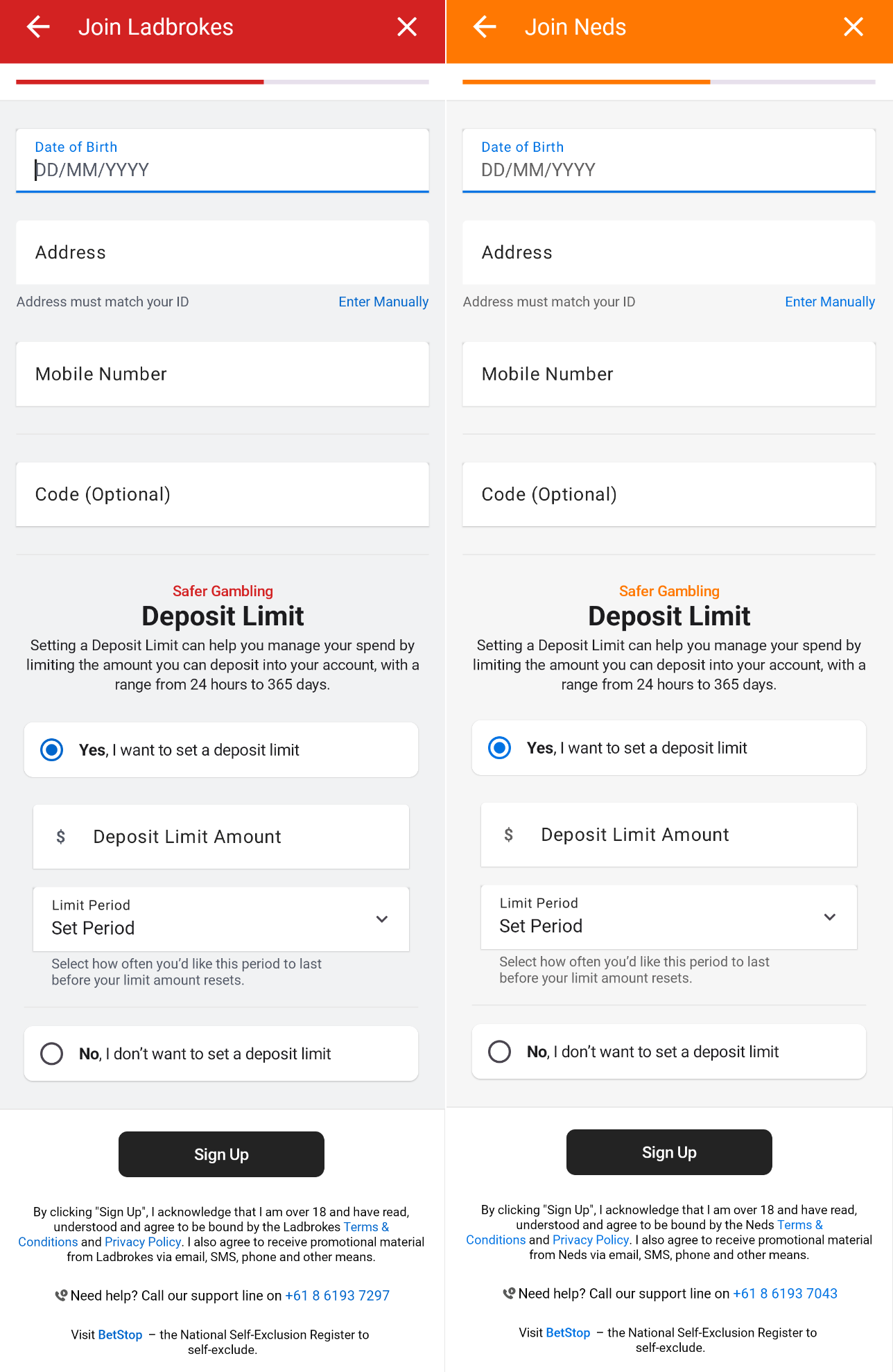
Date of Birth
This field only allows numeric values. Users are allowed to enter a date of birth in the DD/MM/YYYY format. A numeric keypad will be shown and '/' will be automatically inserted as the date is entered.
- The field cannot be empty.
- The date must be valid.
- The date must not be before 01/01/1900
- The user must be at least 18 years old.
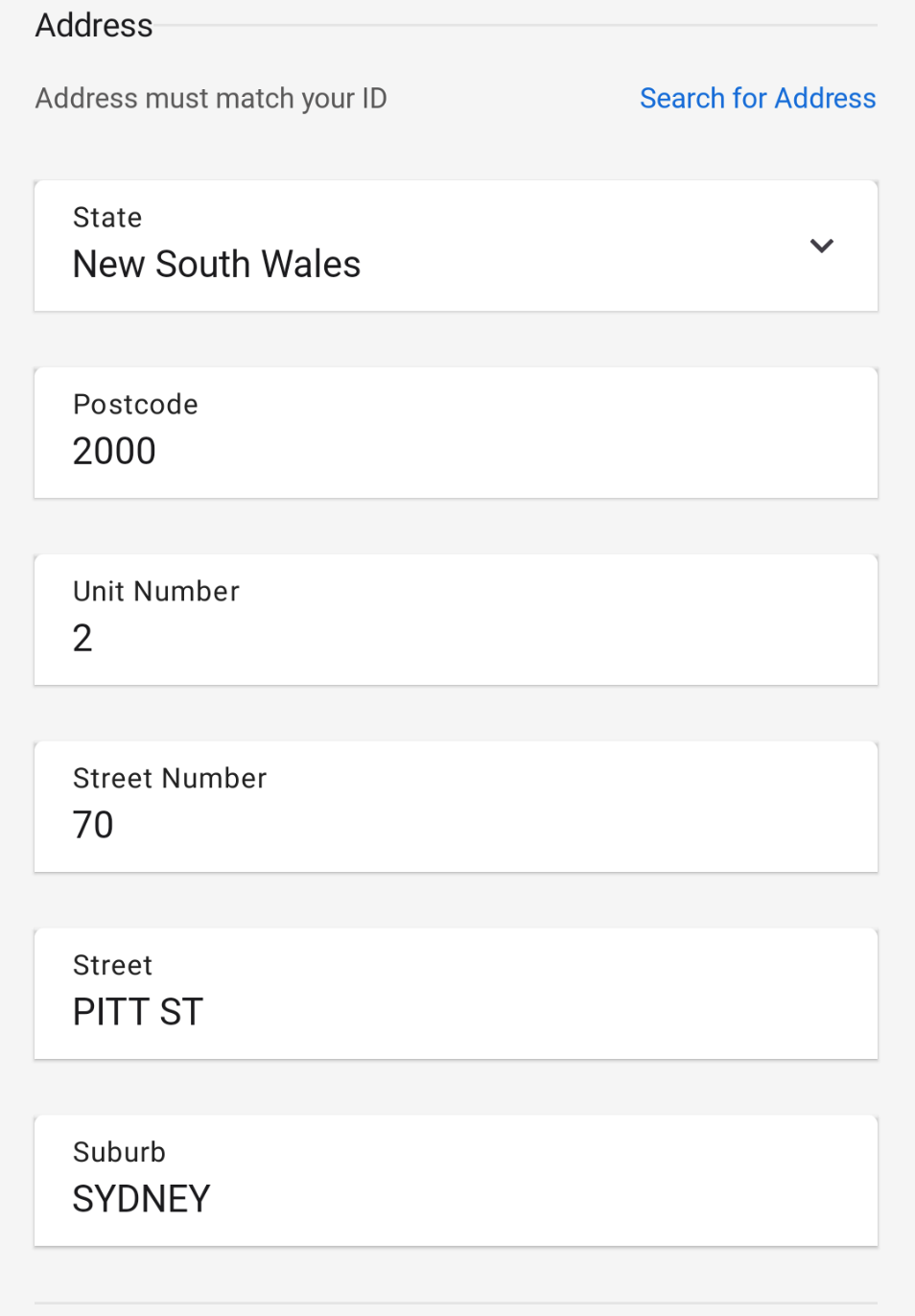
Address
This field allows for automatic or manual entry of the address. By default, it will start in automatic mode to facilitate the user's address entry.
Automatic Address
When entering the address in this field, an API call is made to autocomplete the address for the user. During the search, the field will show a loading state. A dropdown with options will be displayed for the user to select.
Validations for this field:
- The field cannot be empty.
- The entered value must be valid.
Selecting an option will increment the progress bar by 1.
Manual Address
If the user selects manual entry for the address, the following fields will be displayed:
- State
- Post Code
- Unit Number
- Street Number
- Street
- Suburb
Each field will perform its validations and cannot be empty, except for Unit Number, which can be left empty.
Completing these fields validly will increment the progress bar by 1.
Mobile Number
This field allows the entry of phone numbers and displays a numeric keypad to facilitate the input. The validations are as follows:
- The field cannot be empty.
- Any invalid characters entered in the field will be verified with a regex to ensure they are valid.
This field will be validated through an API call to check that the number is unique and has not been used previously.
Completing this field validly will increment the progress bar by 1.
Code (Optional)
This field is optional and is used to enter a referral code. Validation is only performed that entered characters are valid.
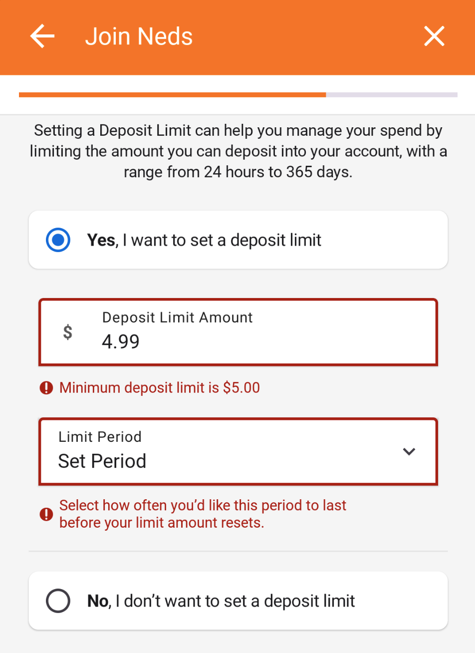
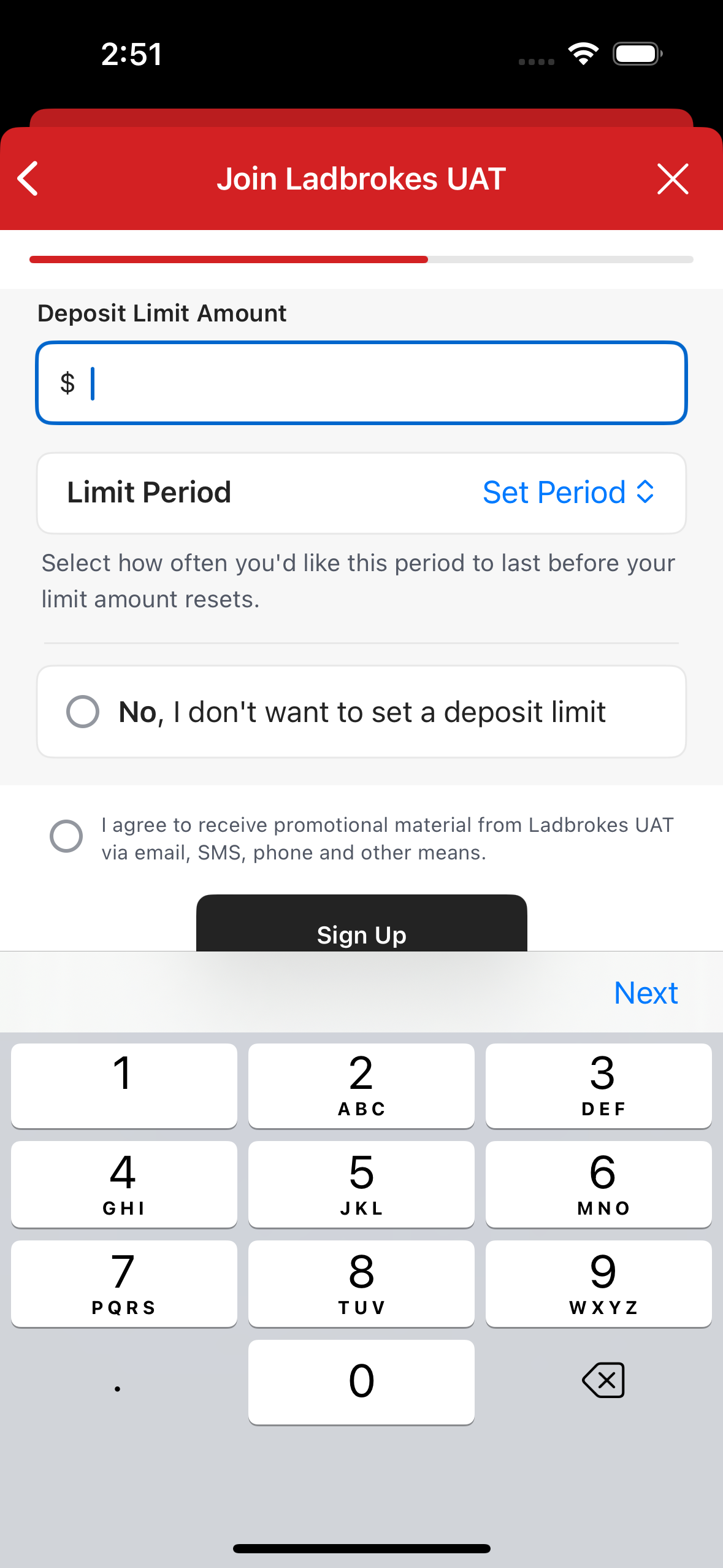
Deposit Limit
Two options are shown to the user:
- "Yes, I want to set a deposit limit"
- "No, I don’t want to set a deposit limit"
Selecting "No" will increment the progress bar by 1. If "Yes" is selected, fields to enter the amount and the period will be displayed.
Deposit Limit Amount
This field allows users to set a monetary limit on their deposits. The validations include:
- The field cannot be empty.
- The entered value is invalid.
- The minimum amount must be $5.00.
Deposit Limit Period
This field will display the available periods in a dropdown. The available periods are:
- 1 day
- 7 days
- 14 days
- 30 days
- 365 days
The only validation for this field is that it cannot be empty.
Entering both the Amount and the Period will validate the Deposit Limit fields and increment the progress bar by 1.
Marketing Opt-in
Users can opt-in to receive marketing communications via email or SMS. The checkbox will only be shown if specific State is selected when filling the Address field(s).
Progress Bar
The progress bar is a component which exists as a motivator for the new customer to complete the sign up process. There are ten required 'steps' in the sign up flow, and as each step gets completed, or in other words as a field gets a valid state, the progress bar will increment.
Below is the progress bar the user will see when they enter the join form, when they're halfway through and finally when they've completed every field.


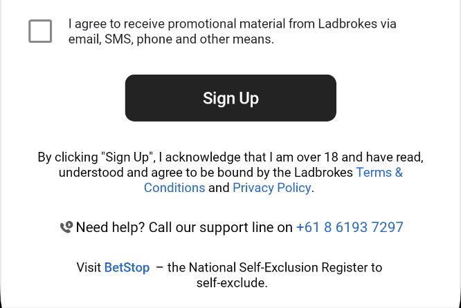
Footer
The join form footer is a shared component that appears at the bottom of page 1 and 2.
In both pages it includes
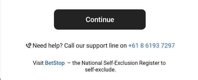
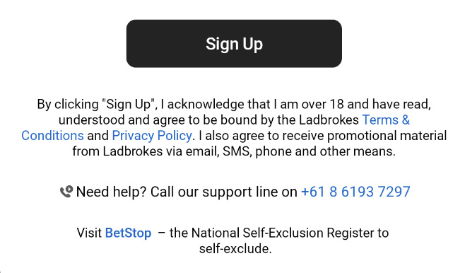
- A call to action button which 'submits' the entered details.
- On page 1, the button validates the user's details, and if the form is valid, navigates the user to page 2.
- On page 2, the button validates the user's details, and if the form is valid, starts the client creation process.
- The "Need help" text, which includes the customer support phone number and launches the phone app.
- The "Visit BetStop" text, which links to the BetStop website.
Page 2 also includes a marketing consent acknowledgement, a link to the terms and conditions page, and a link to the privacy policy page. Based on the state of the entered address, the marketing consent may appear as a separate box the user needs to tick in order to proceed with submission. The states which require explicit marketing are retrieved from app config.
Integrations
Configuration
domain.phones.customerSupport- Customer support Phone Number - from App Config.domain.urls.betstopWebsite- BetStop URL (e.g. https://www.betstop.gov.au) - from App Config.marketing-consent.states- States (e.g. SA and VIC) that require users to opt-in to marketing material
Inputs
Navigation Param: email address
- The email address is persisted from the Welcome Screen to the Join Form.
REST: GET /v2/client/check-email
- Used to check if an email address is valid and available for signup.
REST: GET /v2/client/check-unique-phone
- Used to check if a mobile number is available for signup.
GraphQL: ClientDetailsStartupQuery
- The act of logging in triggers loading the client details, and the client status is used to determine onward navigation.
Outputs
Onward Navigation
- Successful sign up and offers loaded - navigates to Surrogate Offers.
- Terms & Conditions - navigates to RN
ModalWebViewscreen with pathrules-terms-and-conditions. - Privacy Policy - navigates to RN
ModalWebViewscreen with pathrules-terms-and-conditions/privacy-policy. - Deposit - navigates to RN
AccountDepositscreen. - Verification Centre - navigates to RN
VerificationCentreHomescreen. - BetStop link - launches external browser.
- Phone Number - launches phone app.
Android
Page 2
The main components of SignUp Page 2 can be found in signup/presentation/form/page2/SignUpPage2.kt.
Here we find the primary component, which is SignUpPage2. Its main parameters are:
state: SignUpPageStateviewEventHandler: (SignUpPageInputEvent) -> Unit
Both parameters are dependent on the ViewModel, which is shared with SignUpPage1.kt. The ViewModel is located in signup/presentation/form/SignUpPageViewModel.kt.
SignUpPageState
In SignUpPageState, we can find the values for the most important states for SignUp Page 2. Some of these include:
- formProgress: Float: Holds the value for the total progress to draw the progress bar.
- formFieldState: Map<FieldIdentifier, FieldState>: Holds the states for each field, which can be: Unknown (field not yet filled), Invalid, Valid, Error.
- showAddressSuggestions: Boolean: Flag to show or hide the automatic address suggestions box.
- addressSuggestionLoading: Boolean: Flag to show or hide the loading spinner for automatic addresses.
- manualAddressMode: Boolean: Flag indicating the mode for address fields, either manual or automatic. By default, this value is false, meaning the address field starts with automatic search.
- selectedAddress: Address: Holds the selected address.
- addressSuggestionItems: List<AddressSuggestion>: Contains the list of addresses from the automatic address search.
- isMarketingConsentRequired: Boolean and isMarketingConsentChecked: Boolean: The first flag is used to show the checkbox for consenting to marketing contact via email/SMS. The second flag maintains the state of whether it was checked or not.
- page2IsLoading: Boolean: Flag used to show the loading screen in case Page 2 is loading.
These states mentioned are used by SignUp Page 2.
HandleViewEvents
The second parameter of SignUpPage2 is viewEventHandler.
This uses the function handleViewEvents(SignUpPageInputEvent) from SignUpPageViewModel.
This function distributes the logic for various events that occur in the fields. These can be, for example, onFieldInputUpdated, onFieldFocused, onFieldFocusLost, OnMarketingConsentCheckChanged, submitPage, among others.
It is also responsible for triggering analytics events for each field.
DateOfBirthInput
The first field on Page 2 is the DateOfBirthInput component. This allows users to enter a date of birth in the DD/MM/YYYY format. A numeric keyboard will appear, and the '/' will be automatically inserted as the date is entered. When the field loses focus, it performs the following validations:
- EmptyField: The field cannot be empty.
- InvalidDate: The date must be valid.
- Under18: The user must be at least 18 years old.
AddressInput
By default, when opening Page 2 of Sign Up, the AddressInput component will be in automatic mode, allowing the user to search for addresses automatically.
The AddressAutoComplete component is shown if the manualAddressMode state is false. Otherwise, the following fields are displayed for manual address entry using the following components:
- StateInput
- PostcodeInput
- UnitNumberInput
- StreetNumberInput
- StreetInput
- SuburbInput
If an address search is performed and then switched to manual entry, the address will be mapped to the fields automatically, allowing for manual modification of the address.
AddressAutoComplete
For the automatic address field, the EntainAutocompleteTextInputField component is used. This utilizes an ExposedDropdownMenuBox to expand a dropdown list of suggestions.
When performing searches, it executes the updateAddressSuggestions function in SignUpPageViewModel.kt.
The search is performed if the text has more than 3 characters and changes the loading: Boolean value to true. It uses the FindAddressUseCase, which consumes the AddressLookupApi.
interface AddressLookupApi {
  @GET("address/find")
  suspend fun findAddress(
    @Query("sourceOfTruth") sourceOfTruth: String,
    @Query("country") country: String,
    @Query("fullAddress") fullAddress: String,
  ): Response<AddressResponse>

  @GET("address/retrieve")
  suspend fun retrieveAddress(
    @Query("id") id: String,
  ): Response<AddressMappingResponse>
}
If the API call is successful, AddressResult contains a list of Address, which is displayed in the dropdown list for EntainAutocompleteTextInputField.
When selecting an address from the list, it updates the selectedAddress: Address value in SignUpPageState.
Validation done to this field are as follows:
- EmptyField: The field cannot be empty.
- InvalidInput: The entered value is invalid.
ManualAddressInput
If an address has been entered and selected previously, it will be mapped to the manual address fields.
The StateInput field uses SignUpFormExposedDropdownMenu to display Australian states.
All fields except for UnitNumberInput are required and must be valid for the address to be considered valid.
If all fields are valid, it increments the formProgress value in SignUpPageState by 1.
MobileNumberInput
This field allows the entry of phone numbers and displays a numeric keyboard. The following validations are performed on the field:
- EmptyField: The field cannot be empty.
- MobileMustBegin04: The phone number must start with 04.
- InvalidNumberChars: Any invalid characters entered in the field.
The phone number is validated when the field loses focus and calls the CheckPhoneNumberUseCaseRule. It will then call the check-unique-phone API to check that the phone number is unique.
If "+61" is entered at the beginning, it is filtered and replaced with "0". The logic for this filtering can be found in core/.../ui/components/textinput/utils/TextFilter.kt in the String.filterPhone(fallback: String) function.
CodeInput
This field is used for entering a referral code if the user has one. It is optional, and validation is only performed if invalid characters are entered.
This value can also come through DeepLinks if the user clicked on a referral link.
Deposit Limit
The main component for the Deposit Limit is SignUpDepositLimit.
This component displays a description and two options:
- “Yes, I want to set a deposit limit”
- “No, I don’t want to set a deposit limit” Both items are shown as clickable buttons and contain a radio button, which is ticked when an option is selected.
Clicking on the “No” option validates the field and increments the progressBar in SignUpPageState.
If the “Yes” option is clicked, the SignUpDepositLimitSetForm component is displayed, which expands to show two fields:
- SignUpDepositLimitAmountInput
- SignUpDepositLimitDropdownMenu
SignUpDepositLimitAmountInput
This field allows the entry of numeric values and displays a numeric keyboard. The character “.” is allowed to enter decimal values up to two digits, although it is not strictly necessary.
Any invalid format and values are filtered in core/.../ui/components/textinput/utils/TextFilter.kt in the String.filterDecimal(fallback: String) function.
This field performs the following validations when it loses focus:
- EmptyField: The field cannot be empty.
- InvalidInput: The entered value is invalid.
- LessThanMinAmount: The minimum amount must be $5.00.
SignUpDepositLimitDropdownMenu
This field uses the SignUpFormDropdownMenu component to display the available periods for selection. The only validation for this field is that an option must be selected; it cannot be empty.
Validations performed for Deposit Limit fields:
iOS
FormViewModel
The captured user input is stored in the FormViewModel. This object is passed between each screen via parameters on the route. It originates in either the Welcome Screen or Sign Up Page 1 depending on the set feature flag. Each presenter will call initEntainFormViewModelKinds() in its init() to assign a view model to an input field if one doesn't already exist.
Email is a special case as it appears across both welcome and page 1 screens with a different title field.
As each input field can be a select or text input element, we wrap input view models in an EntainFormViewModelKind enum. Each case's associated data takes the view model that's related to it. A convenience method to easily access each view model is set up on FormViewModel.
FormViewModel.UserDetail
All the top-level fields of the form are defined by the enum FormViewModel.UserDetail. This enum allows us to:
- Set whether or not a field is required.
- Set whether or not a field can focus.
- Set input limits
- Set formatted values
- Set autocapitalization values.
- Look up values from the
FormViewModelto validate.
FormValidation
The object responsible for validating user input on both the client and server sides is FormValidation. Each enum case in FormViewModel.UserDetail is mapped to a method that validates its input. These methods are marked async as some fields require server-side checks as listed above.
Each field will return a FormValidation.Result that can either be .valid or .invalid([rules]). FormValidation.Result contains all the error messages that are displayed to the user as well as all the rules that need to be validated. The FormTransformer will use this result to determine the correct state of the form field in question.
Each field's input is validated on de-focus. The result of the validation of the field is stored in var validationResults on the FormViewModel.
FormValidation has convenience methods to validate a single field, page, or the whole form.
Two fields have validation specific to their children: Deposit Limit and Address. For these two fields to be valid, their child fields must be valid if present.
Paging
SignUpPaging is a protocol that each page conforms to. The order of each page's field items is listed in this file should it need to be adjusted.
A page element is a FormViewModel.Row. A row can either be a single column or span multiple columns. The only multi-column row is the title and first name. The SignUpFormView uses these rows to build itself.
Input Focus
Keyboard & Toolbar
When a user focuses on a form input, a functional Toolbar will appear above the native keyboard. This Toolbar enhances the form navigation experience by allowing users to seamlessly move to the next input field without manually de-focusing the current one. The Toolbar will display an action button labeled either Next or Done, depending on whether the current field is the last focus-able element in the form. Tapping Done will automatically close the keyboard and un-focus the form.
The Toolbar also complements the native keyboard’s submit button, which may be labeled Next or Continue instead of Done. Since the native submit button might not always be available, particularly in cases of numerical input, the Toolbar ensures users can still efficiently navigate between input fields.

Child Focus
The sign up form includes instances where additional input fields are available but initially hidden from view. These fields only become visible when the user performs a specific action to expand the form. For example, selecting the "Enter Manually" option will reveal the manual address input fields, and choosing to set a deposit limit will display the corresponding input area.
Focus Logic
Each sign up presenter conforms to SignUpPaging and is responsible for setting up the order of the input fields on each page. This ordering is crucial for the focus management logic, which determines the next input field to focus on when the user taps Next, Done, or Continue. The FormView handles the main SwiftUI implementation, specifically the ToolbarItemGroup that displays the toolbar above the keyboard. Each form input within the FormView has a submitLabel, which is dynamically set based on the SignUpPaging form rows which determines the label Next or Done. Additionally, each presenter includes a focusNextInputField() function, which is called by the FormView and any child views that need to move the focus to the next input field. The focusNextInputField() will be invoked either by the input form onSubmit action or the Toolbar button action.
The core logic for determining the next input focus is implemented in FormViewModel.focusNextInputField(..SignUpPaging). This function identifies which form input should receive focus next by first checking if any child forms have active focus through FormViewModel.childFormFocus. Each child view has its own ViewModel that manages focus within that view, determining the next input field, such as with focusNextManualAddressFormFieldInput. When a child form reaches the end of its inputs, it returns the focus to the main form, where focusRootFormInput determines the next root input field to receive focus. For certain input fields, like drop-downs e.g administrative area and title, focus may not be applicable. To address this, we've established a pattern to determine when allowsFocus should be applied.
Page 2
Most of the code related to page 2 is in the
PresentationLayer/Sources/SignUpUI/Screens/PageTwo directory. The
coordinator and an extension on it that deals with the createClient request
are in the PresentationLayer/Sources/SignUpUI directory.
SignUpPageTwoCoordinator
This is the entry point to page 2 of the sign up flow.
The route to page 2 is expected to have a parameter which contains a
FormViewModel, so that data entered on previous screens can be carried
through and submitted to the API when the user presses the Sign Up button at
the bottom of the form.
This class conforms to the SignUpPageTwoPresenterDelegate protocol, which
allows the presenter to inform it of actions the user takes. Most of the
functions in this protocol are only for analytics purposes, but three of them
do more than just send analytics events.
signUpPageTwoPresenterDelegateTermsAndConditionsSelected: This function opens a web view that displays terms and conditions information.signUpPageTwoPresenterDelegatePrivacyPolicySelected: This function opens a web view that displays privacy information.signUpPageTwoPresenterDelegateContinueSelected: This function, if itsshouldContinueargument istrue, will call thecreateClientfunction defined in the extension described below.
SignUpPageTwoCoordinator+CreateClient
The only non-private function on this extension is createClient. This
function attempts to build a CreateUserModel and use it in a call to the
createClient function of SignUpInteractor. The function then uses private
helper functions to handle the success or failure of that API call, navigating
the user to the appropriate screen, or showing them an alert if some kind of
error occurred.
SignUpAddressLookup
This struct provides an interface between AddressLookupInteractor and
SignUpPageTwoAddressHandler that handles the logic for updating the address
suggestions, and the address form view model based on a selected address
suggestion. It has two non-private functions:
searchAndPopulateSuggestions, andretrieveFullAddress.
searchAndPopulateSuggestions calls the findAddress
function of AddressLookupInteractor, and handles the result. If it is
successful, a list of dress suggestions is set on the form view model, and
displayed to the user.
retrieveFullAddress calls the retrieveAddress function of
AddressLookupInteractor with a Place ID from an address suggestion, and
updates the address form view model with the full information for the selected
address suggestion.
SignUpPageTwoAddressHandler
This struct implements AddressSuggestionsActions, which is a protocol that
defines a number of functions necessary to respond to actions the user takes
regarding the address search field and suggestions list. It updates state in
the form and address form view models in response to user actions, and acts
and an interface to SignUpAddressLookup. The protocol contains the following
functions:
protocol:
addressSuggestionsSelectAddressAction,addressSuggestionsEnterAddressManuallyAction,addressSuggestionsBackgroundTapAction,addressSuggestionsInputTextWasUpdatedAction,addressSuggestionsClearButtonAction, andaddressSuggestionsOnSubmitAction.
addressSuggestionsSelectAddressAction is called when the user taps an
address suggestion in the suggestion list. It causes the selected suggestion
to become the text in the address search field, and for the full details of
that address to be retrieved based on its Place ID.
addressSuggestionsEnterAddressManuallyAction is called when the user taps a
button to switch to manual address entry mode. If a suggested address has been
selected, the details of that address will pre-fill the manual address form
fields.
addressSuggestionsBackgroundTapAction is called when the user taps anywhere
on the screen that isn’t the address suggestions list while the list is
visible. It closes the suggestions list.
addressSuggestionsInputTextWasUpdatedAction is called when the user changes
the text in the address search field. It causes a new search to be performed
after a slight delay, if there are more than 3 characters in the field.
addressSuggestionsClearButtonAction is called when the user taps the clear
button in the address search field, and removes and selected address info from
the view models and clears the input field.
addressSuggestionsOnSubmitAction is called when the user presses return with
the address search field focused, and triggers a search for the input in the
address search field.
SignUpPageTwoPresenter
This is where most of the logic for page two of the sign-up form is
located. The public interface used by SignUpPageTwoView is a protocol called
SignUpPageTwoPresenting. It contains the following functions:
footerButtonAction,customerSupportSelected,betstopLinkSelected,termsAndConditionsLinkSelected,privacyPolicyLinkSelected,onMarketingConsentChanged,formFocusChangeToUserDetail,userDetail(valueChanged:),signUpPageTwoDepositLimitActionSelected,searchForAddressAction,formFocusChangeToAddressDetail,addressDetail(valueChanged:), andfocusNextInputField.
footerButtonAction is called when the user taps the Sign Up button at the
bottom of the form. It disables the form, validates all fields, and attempts
to send the create user request if all required fields are valid.
customerSupportSelected is called when the user taps the customer support
phone number in the footer. It informs the delegate about the tap for
analytics tracking.
betstopLinkSelected is called when the user taps the Betstop link in the
footer. It informs the delegate about the tap for analytics tracking.
termsAndConditionsLinkSelected is called when the user taps either the terms
and conditions or privacy policy link the footer. It informs the delegate
so that it can route to the appropriate screen.
privacyPolicyLinkSelected is called when the user taps the privacy policy
link in the footer. It informs the delegate about the tap for analytics
tracking.
onMarketingConsentChanged is called when the user taps the marketing consent
checkbox, and it records the latest value of the checkbox.
formFocusChangeToUserDetail is called when the user changes which field is
focused. After a field has been de-focused, it is validated. The delegate is
also informed of field focus changes for analytics tracking.
userDetail(valueChanged:) is called when the user updates the value of a
form field. It causes the validation state for the changed field to be reset.
signUpPageTwoDepositLimitActionSelected is called when the user changes the
deposit limit, to record the deposit limit settings they choose.
searchForAddressAction is called when the user taps the search key while the
address search field is focused. It ensures the form is not in manual address
entry mode, and updates the progress bar. It does not explicitly start a
search, because a search will already have been started after any change to
the search field the user makes, as long the query is more than 3 characters
long.
formFocusChangeToAddressDetail is called when a field is de-focused in the
manual address form. It causes the field that was switched away from to be
validated, and keeps track of the new field that was focused.
addressDetail(valueChanged:) is called whenever the user updates the value
of a field in the address form. It resets the validation state of the field.
focusNextInputField is called when the user taps the Next button in the
toolbar above the keyboard. It calls a function of the same name on the form
view model.
SignUpPageTwoView
This struct mostly creates a number of Binds that are passed to FormView.
Troubleshooting
Android
No error message
If you've entered input that you expect to fail a field's validation rules but you're not seeing an
error message, ensure that you're mapping the correct FieldValidationError object to an error
message string in the relevant composable.
FocusRequester is not initialized.
If you're encountering a runtime when attempting to request focus on a field, ensure that the field
is in composition before calling requestFocus(). Because a LazyColumn() is the parent of all the
input fields, any field that isn't currently on screen won't be rendered, so attempting request focus
on an offscreen field will not work.
Ensure that animateScrollToItem is being called on the relevant field before any requestFocus
call is made.
iOS
Validation Rules - Do I write a new rule in the presentation or domain layer?
The validation rules in the domain layer are more general in scope and can be adjusted to reflect more business logic rules. For example, the domain layer has a LengthValidation rule where you can specify a range that the input length must be to result .valid.
A rule in the presentation layer might consume with LengthValidation in a local variable and call it minimum8CharsValidation.
So if it's something specific, it probably belongs in the presentation layer. If it can be repurposed and describes many different rules, then it could belong in the domain layer.
How do I change the order of a field item on a page?
Head to SignUpPaging and locate the page. Add, remove, and move items there.
How to format text input
Each EntainFormInputField exposes a .onChange handler. If you need to modify or format the input, it's best to handle this in the bind. The FormViewModel has a method formattedValue(_ value: String) that will map to each of the fields. The date of birth and mobile fields are two that support custom formatting. The other user details format is based on input length.
Resources
- Epic - Page 1 - Jira
- Epic - Page 2 - Jira
- Epic - Submission - Jira
- Epic - Shared Components - Jira
- Reported Bugs - Jira
- Tech Debt - Jira
| Role | Contact |
|---|---|
| PM | Lily Sommers |
| Android Lead | Anthony Librio |
| iOS Lead | Nicholas Vella |